The logo will appear on matchday kits until the 2023/24 season.
Ahead of Spartak’s centenary on 18 April, the club have presented a special anniversary logo, which will be used until the end of the 2022/23 season.
"The club celebrates its anniversary year with the same desire to be a leader on the football pitch and in everything that surrounds our beloved team. Following modern trends, the club has updated the logo, rethinking all its elements, and created its own unique font," the official Spartak website explains, quoting commercial director Rustam Makhmutov.
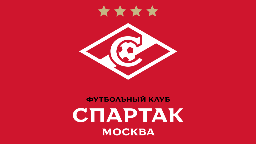
"Every element of the emblem has been reinterpreted and brought to a single large-scale line," said Andrey Gorbunov, author of the project and art director of the Quberten sports design studio. "Thanks to global rules, the sign looks solid, with multiple themes and strong connections between all its parts.”
“The rhombus is built strictly geometrically with a modular angle of 30 degrees, which is supported in all elements of the emblem and style. The bevels of the letter "C" are also in line with the corners of the rhombus, so there is not a single superfluous or random line in the crest. At the request of the club, the ball has been graphically "dissolved" into the strip and now looks not as accentuated as on the 1998 or 2013 variants.
“Based on the new material of the crest and the letter "C", a special recognisable font ‘FCSM Antiqua’ was designed, containing lower case and upper case letters, as well as a special font ‘FCSM Sans Sans serif’. This is a full-fledged and cool font that no other RPL club has."
In 2022, Spartak will celebrate the 100th anniversary of the founding of the club.


Обратная связь
Вы можете обратиться в РФПЛ с интересующим Вас вопросом или оставить сообщение (пожелание, замечание). Также вы можете сообщить имеющиеся у вас сведения о "договорных" матчах.